- Eco Footprint vs GDP
- Impact by Nation
- Global Carbon Footprint
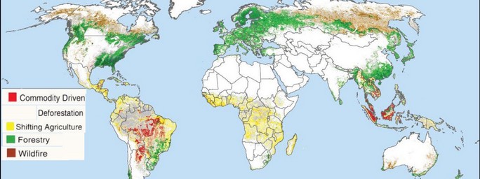
- Challenges of Deforestation Measurement
The Global Footprint Network – GFN.org – defines both
—-> (a) the demand for resources (ecological footprint) and
—-> (b) the world’s bio capacity to supply resources,
in terms of Global Hectares (gha or gH). This allows quantitative or measured comparison of what we consume, relative to what the earth can provide or re-generate over time. The concept is captured on the GFN website, in a chart like this:
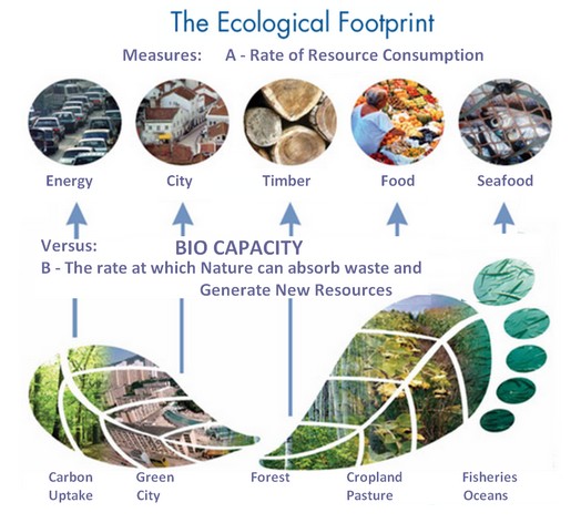
Titles in this chart (created by GFN) have been increased in size to make them readable. One or two were modified in minor ways to distinguish between consumption (demand) and bio capacity (supply).
Return to the top
FootPrint vs GDP per Capita
An excellent chart showing this relationship for many nations follows:
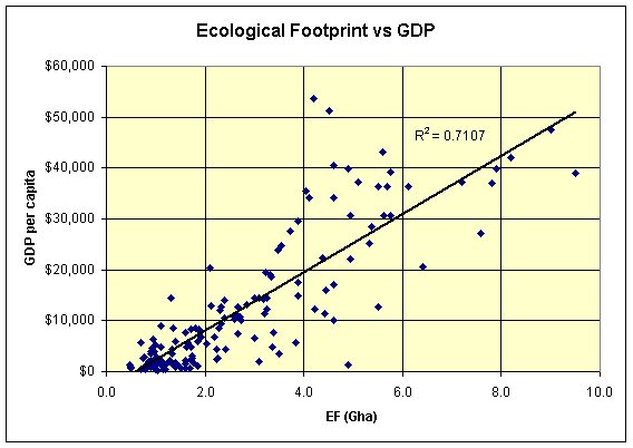
Source: Page at Democratic Underground.com. The scatter graph clearly shows that most countries with a higher GDP per capita (most developed, generally, or oil rich) also have a higher Ecological Footprint – EF. The average EF for the planet of 7 billion people is less than two. Developed countries are spending more resources than they can sustain. Clearly there is a serious challenge in balancing being affluent and sustainable at the same time. The view is expanded next:
Return to the top
Size of Nations and Impact on GDP versus Ecological Footprint
Some of the points on the chart above are big nations like China, India, the USA and Indonesia. Their relative impact is higher, as seen in the similar chart below:
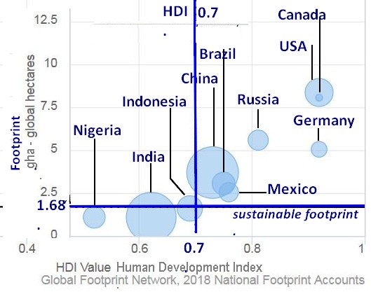
Here, Human Development Index, HDI, is largely comprised of GDP per Capita (as above), plus education and opportunity factors for citizens. This chart was based on data and modelling by the Global Footprint Network. A final comment on Bio Capacity and Ecological Footprint: Standards for these measurements are continuously being improved.
If the World Economic Forum would focus more attention on Bio Capacity, It would be a great thing for the Planet Earth and all its people (us).
Global Carbon Footprint
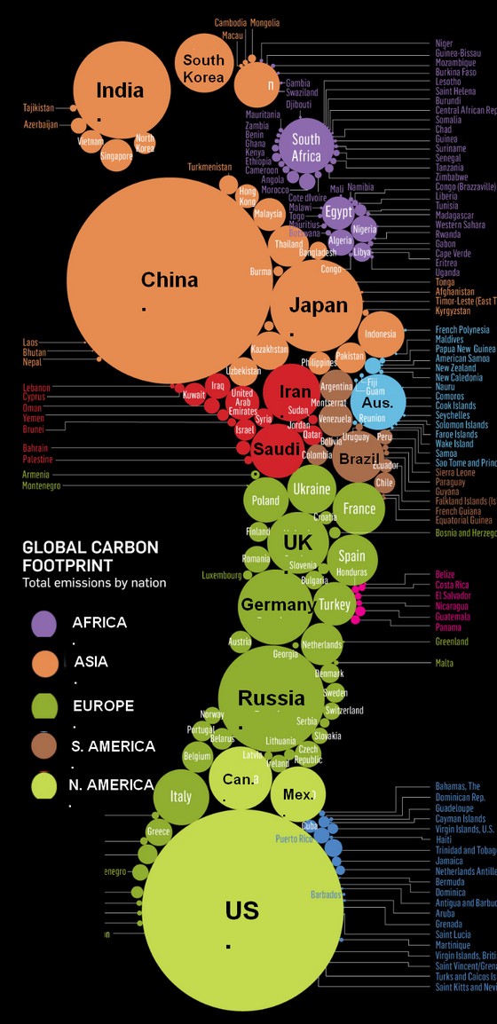 |
A miniature view of one of the many brilliant and effective graphics seen at the designer’s website:
Source: Stanford Kay Information-graphics and illustration group. The image was developed for Newsweek’s International Edition and later published in the April issue of the Atlantic Monthly. Click the Stanford Kay link to see the full size image and their website information. |
Source: Stanford Kay Information-graphics and illustration group.
Return to the top
Challenges of Deforestation Measurement
The map below appears in a Yale Education study of variations in reporting forest losses. Satellite data by World Resource Institute (WRI.org) measures forest loss, but not causes. National reporting has trouble being accurate via “land use” categories. Results vary widely in the two views, satellite vs reporting. But in both views of the planet, deforestation continues.